The best logos are simple, readable at any size, and designed in a way that can be easily displayed on multiple media.
This article is designed to help you understand what a good logo looks like. As with all the articles I write, they come out of concern for my clients. In my 15+ years in web & graphic design, I’ve seen some awful business logos. They were too complicated, ugly, and made no sense—but the client didn’t know that.
In most cases, I just flat out told the client, “Your logo needs improvement.” I tried my best to work with their logo, and sometimes I had it refined.
The logo is just one part of your overall brand. A professional logo is important because it’s one of the first impressions your customer gets when they visit your website.
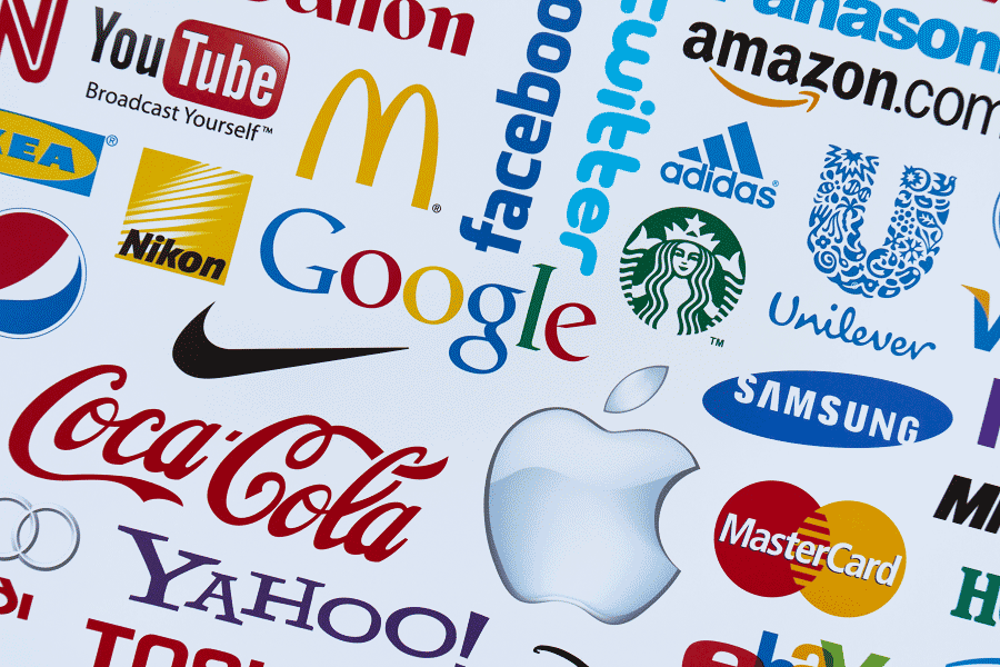
Let’s look at some professionally designed, famous logos, and see the commonalities between them (all logos on this page are the property of their respective owners).
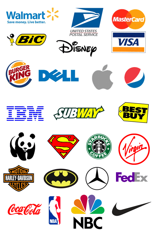
Here’s what they all have in common:
Easily recognized shapes
These logos use shapes that are recognizable and easy to understand: text, circles, apples, blocks, pandas, birds, price tags, arrows, and ovals. When we look at these shapes, we easily understand and remember them.
Bold text
Notice the bold letters, they grab your attention, and they stand out. Even though the IBM logo has lines going through it, it still is bold, strong, and understandable. At small sizes, the logo’s text is still readable.
One font
As you can see, these logos only use one font. The more fonts there are, the more complicated, and possibly, more difficult it is to read.
Relates to the industry
Some of the logos are identified with the industry, product, or service, and give a clear picture of what is being marketed. With NBC, we get a multicolored peacock to reflect the enhancements in color broadcasting.
With FedEx, there’s an arrow between the E and X signifying motion and fast transport. The U.S. Postal service used an eagle for the U.S. and thick bold streaks to show the motion of mail delivery. The World Wildlife Fund uses a panda. Apple used an apple.
Simple
All the logos are simple shapes and colors. They don’t use gradients, drop shadows, and bevels; just clean and simple strokes. The reason for this is because the more lines you add, the more complicated for the viewer to understand. Simple logos can be scaled down to very tiny sizes, and yet still be readable.
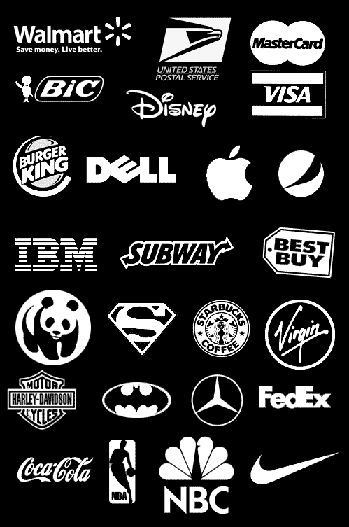
Minimal colors
On average, the best logos use one to two colors; this is because the more colors you add, the more costly the logo gets when you want to print and reproduce it in different media.
Minimal colors make the logo easy to translate to other media like signage or coffee mugs. Minimal colors work when the logo can only be presented in one color due to design restrictions. See how these logos still work even though they’ve been altered for black and white display?
Not too tall, not too wide
Except for the NBA logo, most of the logos seen above could fit inside a squared space without too much being cropped off. It’s important that your logo stay away from extreme heights or widths because it will make it hard to display in restricted spaces without some cropping or down-scaling.
Look at the aspect ratio of the icons on your smartphone, on your browser’s tabs, or on any social media site, and you’ll find they all have an even aspect ratio (1:1). This is the standard display format in technology, and it’s important that you consider the aspect ratio of the logo’s design within different restrictions.
Never buy a graphical icon
Once you have a solid logo like the above, you can play with it and add effects like Apple, and other companies do below:
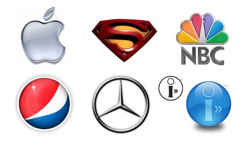
As you can see above, these logos (better described as graphical icons) use bevels, gradients, and drop shadows, but we know they didn’t start out this way.
I advise you to never accept (even though it looks cool) a logo from a designer that looks like the above. When it comes time to change the media to display the logo on, it will be challenging to make the logo work; this is why professional logos are so simple, they must function across multiple media.
Finding a great logo designer
Search Google, Behance, and Dribbble for great logo designers; and don’t expect to pay low prices. A great logo is a work of art, and it takes talent to design something that is unique and fitting.
To determine if the logo designer is capable of designing a professional logo, review their portfolio, and see if the logos they’ve created follow most of the principles in this article.
Ask them about their process. A good logo designer wants to understand your brand and your business goals. With this information, they can create something that will speak to your customers.